kick-ass web design trends that are here to stay
The relationship between aesthetics and technology has never been more exciting. With new functionality being introduced into the marketplace at lightning speed, web design challenges are mushrooming.
But they have only driven us to become more creative, strategic and committed to delivering just plain beautiful kick-ass websites.
With more than 65% of web traffic happening on a variety of mobile devices, web design has had to incorporate a lot of problem-solving into their design schemes, opting for more focused approaches that yield higher impact and help brands break through the digital noise.
We’ve put together our favorite kick-ass web design trends that we will be focusing on for 2020 and beyond.
12 Kick-Ass Web Design Trends that are here to stay:
1. Negative Spaces
2. Custom Illustrations & Graphics
3. Subtle Animation
4. Minimal Studio Photography
5. Drop Shadows
6. Big Bold Typography
7. Bright Colors & Gradients
8. Get Print Ready
9. Hand Drawn
10. Microinteractions
11. Particle Backgrounds
12. Asymmetric Layouts
1. Negative Spaces
It’s time to breathe a little.
We are all used to full-width responsive websites crammed full of text and images and call-to-actions. We get it. They are trying to max out their web real estate. But it’s just so exhausting. We’re tired.
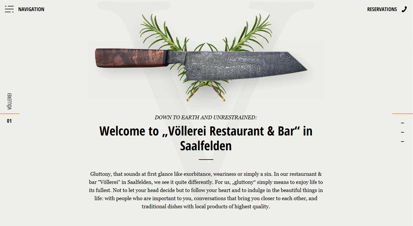
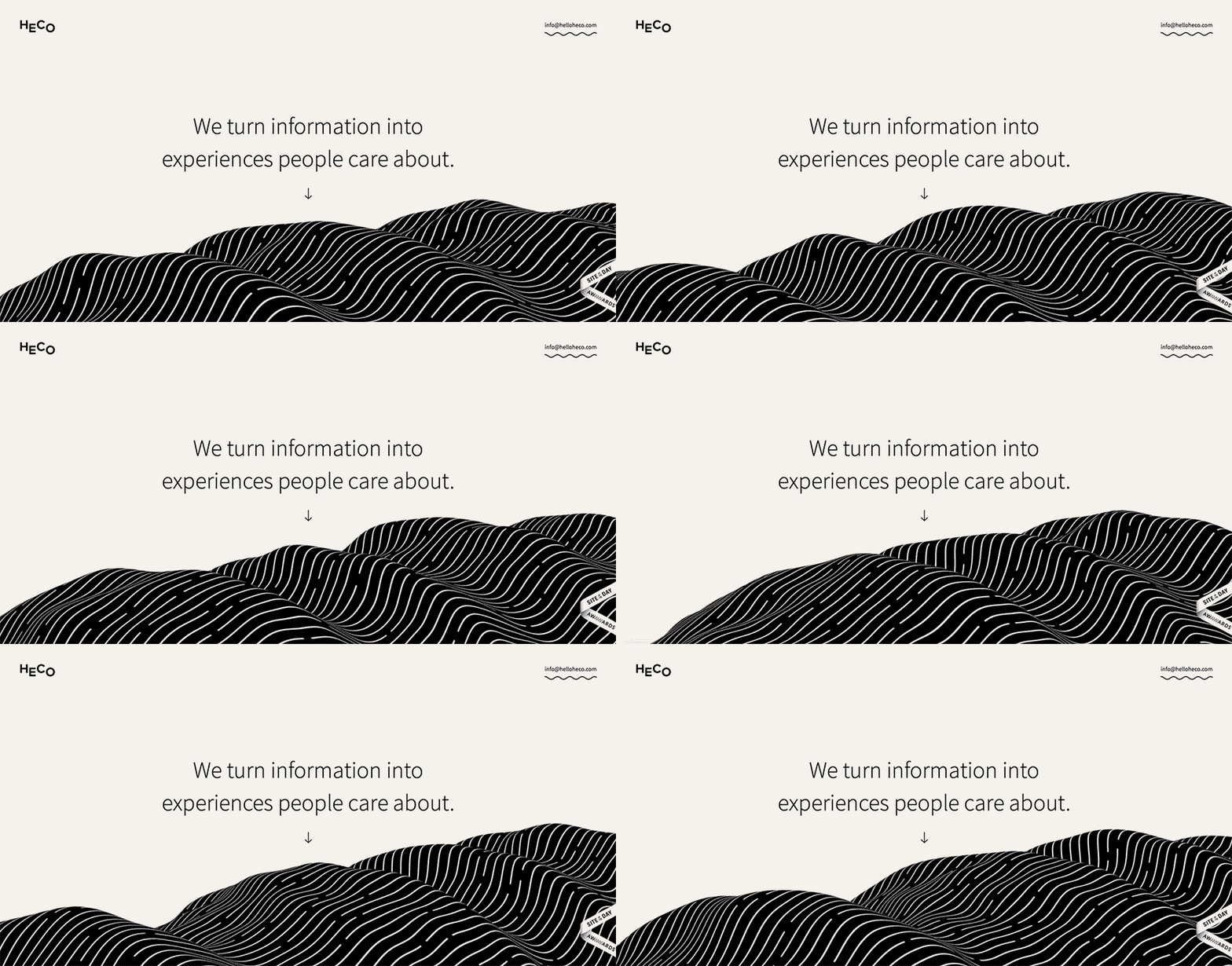
More and more, white (or content-negative) spaces are taking over the field of view. It’s like an anti-space domination phenomenon.
What we are seeing are text & images surrounded by lots of space, whether it be white, black, and all of the colors in between.
This allows for these minimal texts and bold graphics to pop off the page. There is digitally nothing else to look at.
It also produces a calming effect, allowing the viewer to easily digest the information on the screen right in front of them. The urge to scroll down becomes less so, and the idea of time suddenly feels like it might be on your side.
2. Custom Illustrations & Graphics
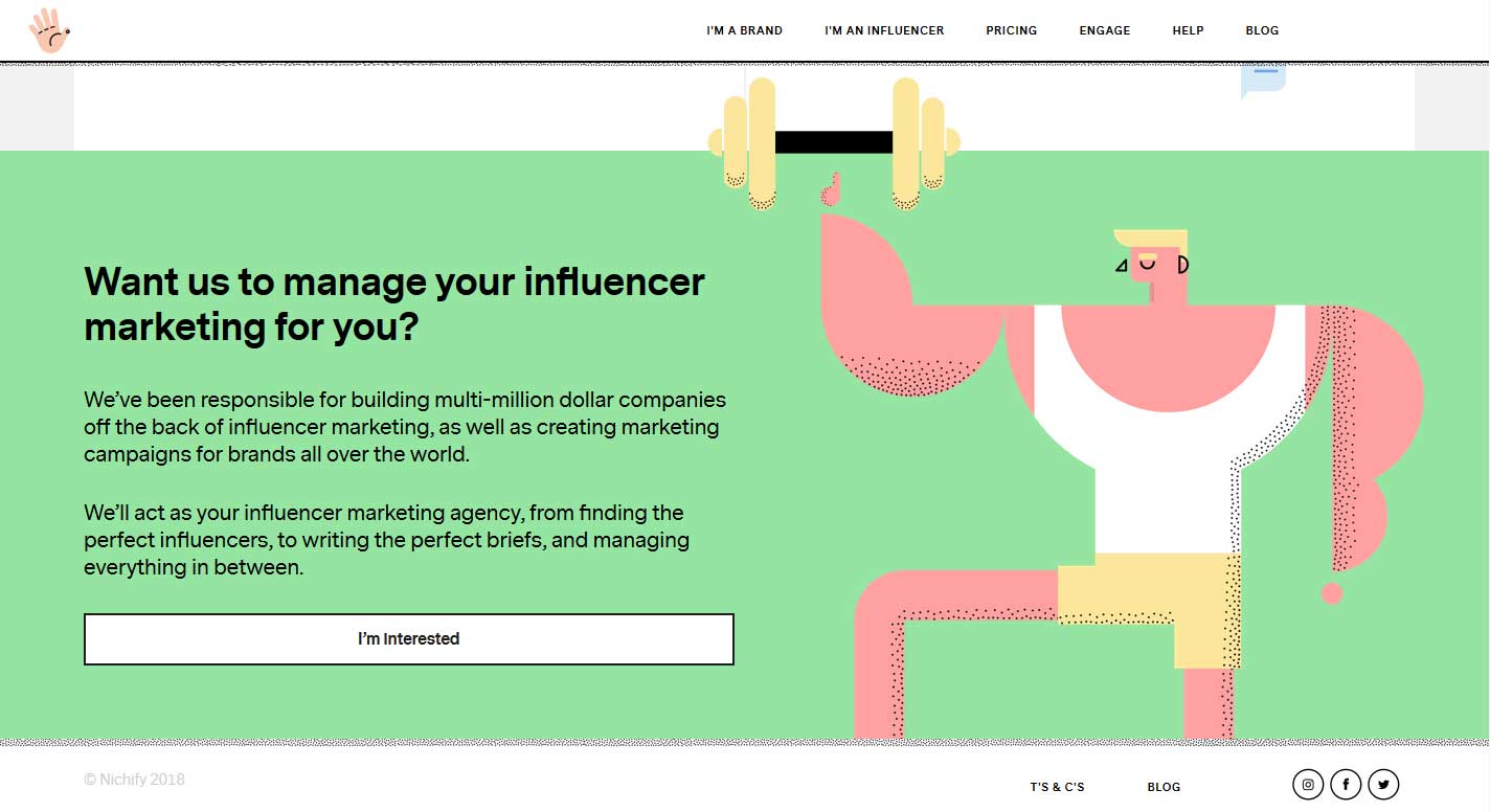
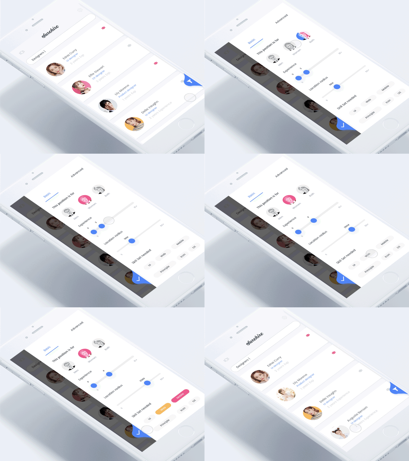
Branding has never been more important. And there is no better way to express it than by creating custom illustrations and graphics. Literally, they are yours and only yours, and if done right, they can become iconic beyond imagination.
This has been happening slowly over the last few years. But what is different now is that really edgy brands are having them become the dominant design behind their entire web presence, replacing actual photography and any other graphic style.
The trend is heading towards flat graphics that are simplified and highly stylized.
3. Subtle Animation
Videos and animated gifs are hardly new. Reports abound about how vidoes increase traffic retention anywhere from 25-78%.
But what is new is that the animation is becoming more subtle, and strategically placed. Rather than be completely submersive and dominating the entire screen, which drains load times and even attention spans (sadly), the animation is concentrated in a single area of the screen.
This draws your attention to a specific section of the screen, creating a single focal point.
Overall this creates a design that is less distracting and ultimately occurs in a loop, in case you missed it the first… second… third… fourth… fifth… etc… time.
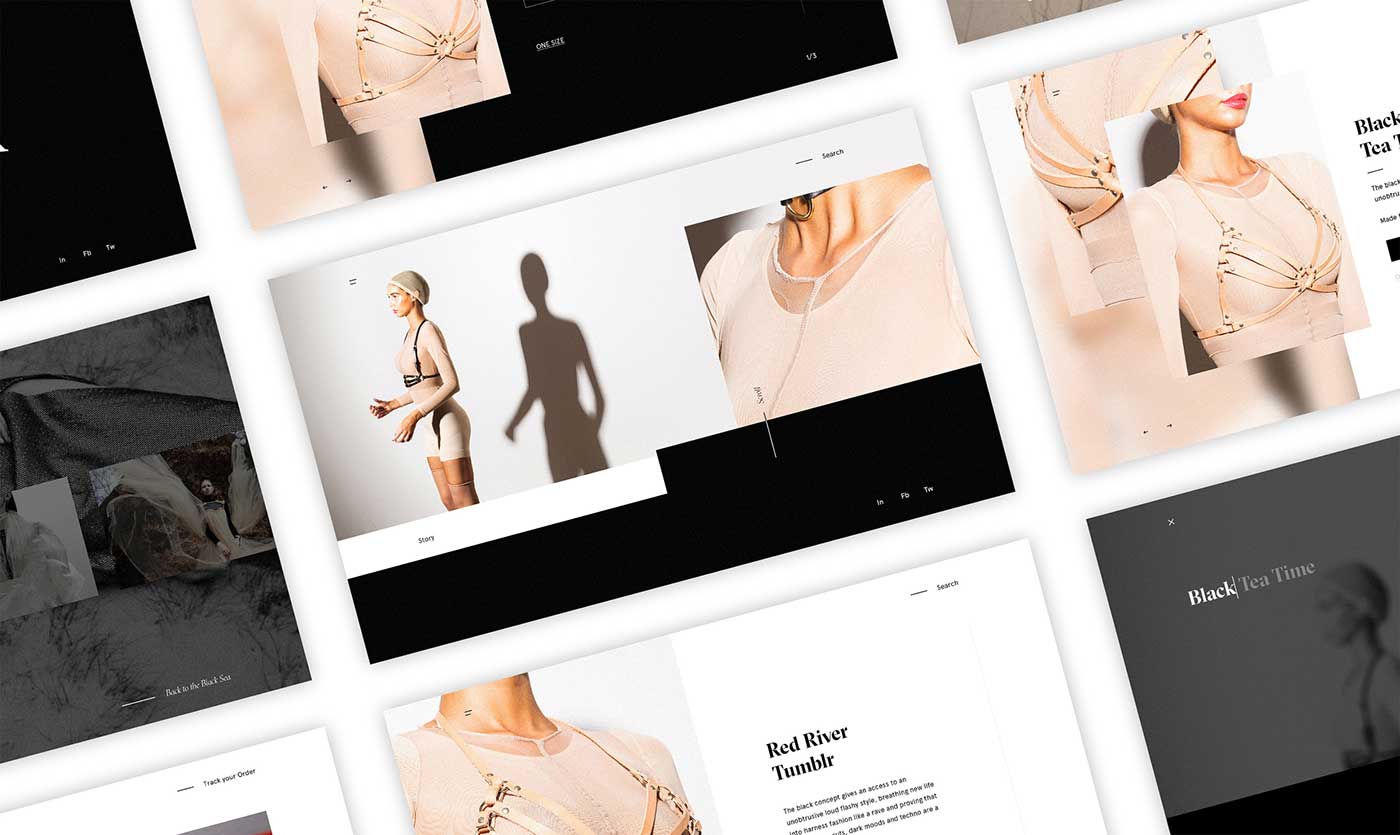
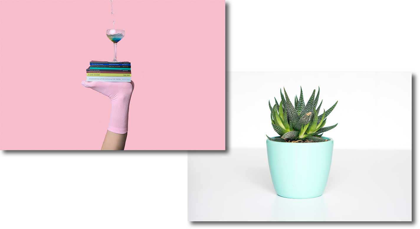
4. Minimal Studio Photography
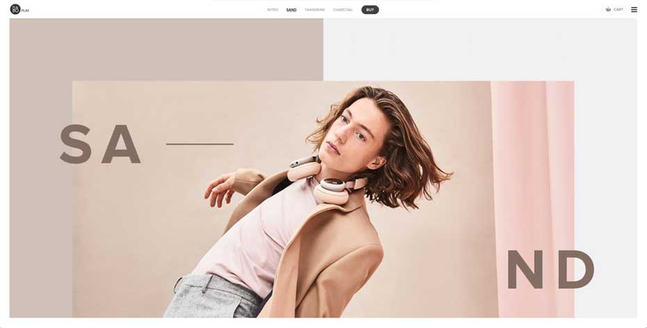
Originally born from e-commerce on sites such as Shopify and Square Space — which use simple design templates to display products — Minimalism in web imagery is becoming more and more prevalent. Not only does it easily allow for text or other images overlays, it is simply easy to look at and very focused.
Expect to see lots of images with negative spaces, whether it be on a clean white or grey background, or on a super colorful backdrop with tons of perspective.
A single and clear focus are the main objectives.
5. Drop Shadows
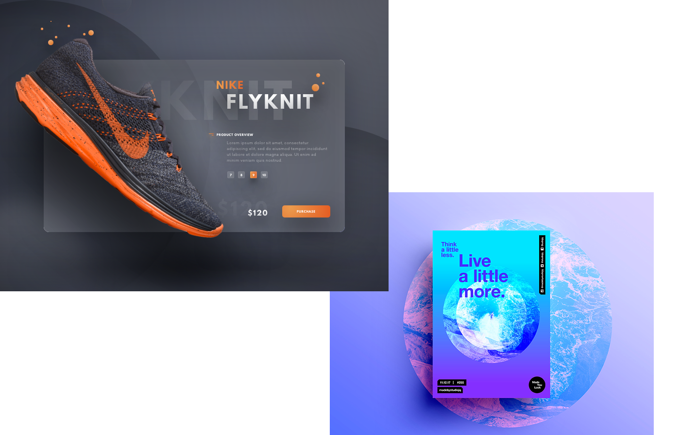
Box shadows are bigger than ever.
Shadows create depth and therefore draw your eye to a single focal point. They also bring an element of 3D to the screen, without requiring you to bust out your virtual reality goggles.
With the world of design in general — beyond web or digital — going towards 3D, it’s no wonder that websites are adding this design technique. It’s a way to digitally reach out to customers from their screens and make that personal connection.
6. Big Bold Typography
Bigger is better — at least when it comes to header font sizes.
Jumbo sized fonts are replacing images as a creative way to get your attention. So, instead of a crazy pic of someone diving off of a cliff, web designers are opting for super large header fonts as a succinct way to get their message across.
Font styles already carry so many meanings (this is a separate issue), whether it be classic or modern or silly or romantic. And when they are amplified into mega huge characters, and layered on a negative space with nothing but space to make your eyes look at it — well, no wonder this is a good idea.
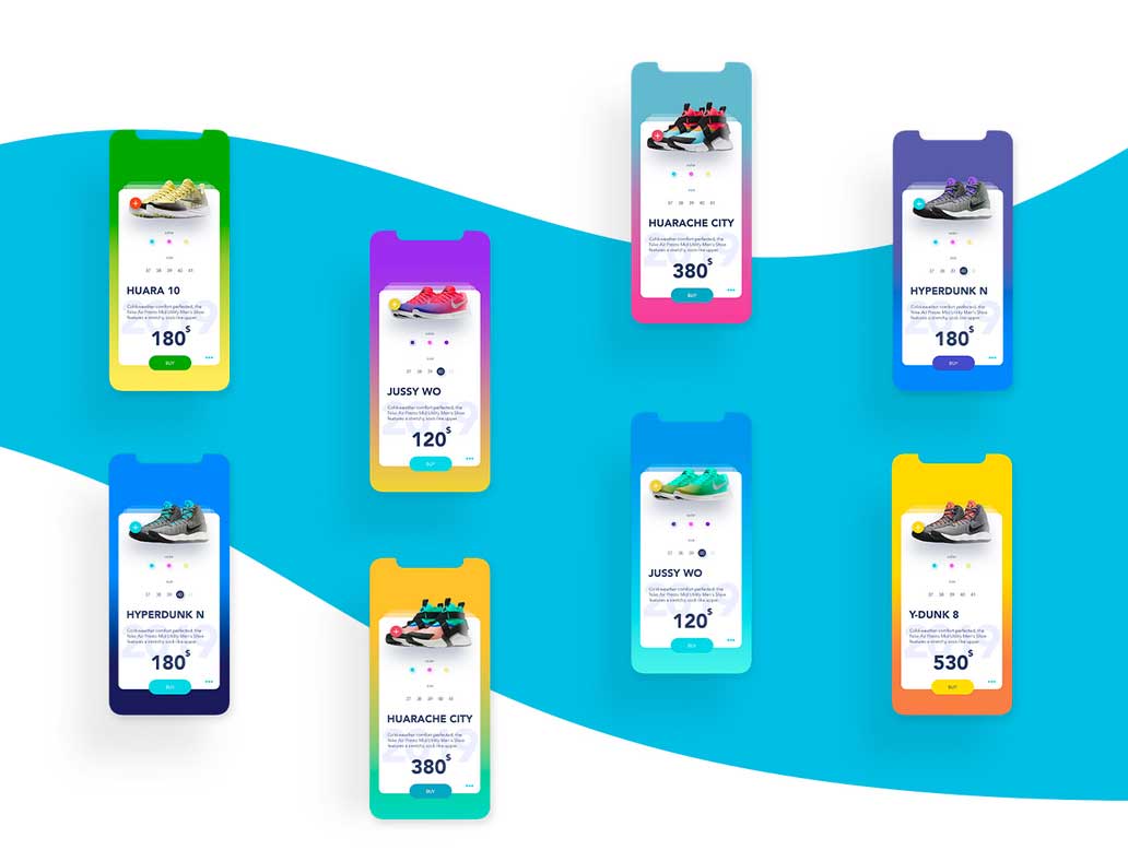
7. Bright Colors & Gradients
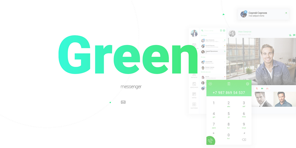
This color story has been building for a while now — and it is not going away.
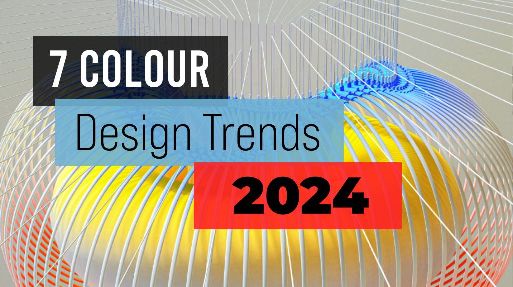
Steering away from primary colors, these brights range from pastels to retro 80’s and 90’s vintages such as mint, salmon, peach, blues, and punchy purples.
What do they have in common? Sky-high saturation levels.
8. Get Print Ready
No matter how digital we go, print is something that we can not ignore. This is because people still want to print something and have it physically in their hands. Only if it’s just that special, of course.
But there are other practical reasons : a quick meeting with the boss in 5 minutes; a drive out to a secluded area with limited WiFi to see your real estate agent; or just the old-fashioned desire to see it printed larger than the length from your thumb-to-index-finger.
Whatever the reason, people are increasingly printing stuff off of websites. Reading mode in browser uses print CSS to show the content. It’s time to get familiar with this.
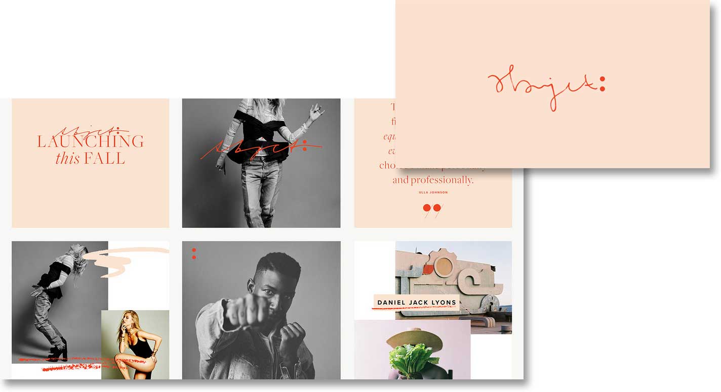
9. Hand Drawn
Whether it be fonts, icons, or graphic elements such as outlines and frames – anything that has a hand-touch element is making its way onto web pages in a big way.
It also gives a softer, personal touch as a counter-balance to the sharpness of bold graphics and crisp photography.
10. Microinteractions
Product demos are very powerful.
What does suck is having to click on a link, or open something in YouTube, or just simply wait for a video to load. In all fairness, it shouldn’t suck (any of these things couldn’t take more than 10 seconds). But the reality is that they all do (suck).
Enter microinteractions. These are contained product moments that revolve around a single use case — they have one main task. They are the perfect way to insert a quick product demo of a specific functionality. Yay.
11. Particle Backgrounds
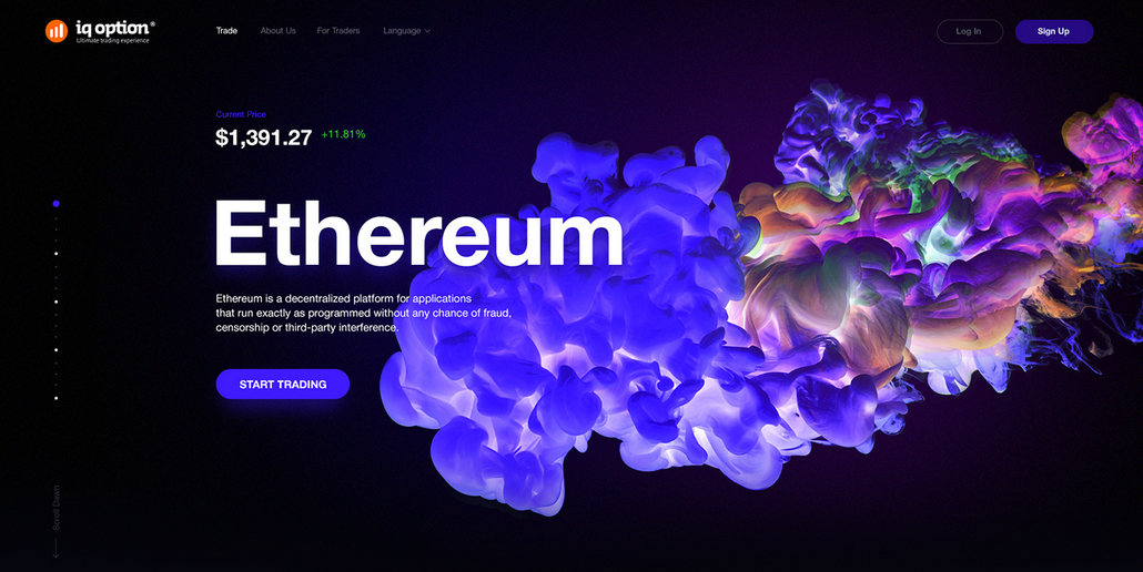
Over the last few years we have seen an explosion of video backgrounds in web design.
The problem this has caused is a major slow down in a site’s load time. And because it takes only a few seconds for you to lose 40% of your traffic (3.8 seconds, to be precise), this has become a real big problem.
Particle backgrounds are great alternative. With animations in javascript, the movement is created as a natural part of the background, making it lightweight and fast. Light as a feather (or as a particle, as it were).
12. Asymmetric Layouts
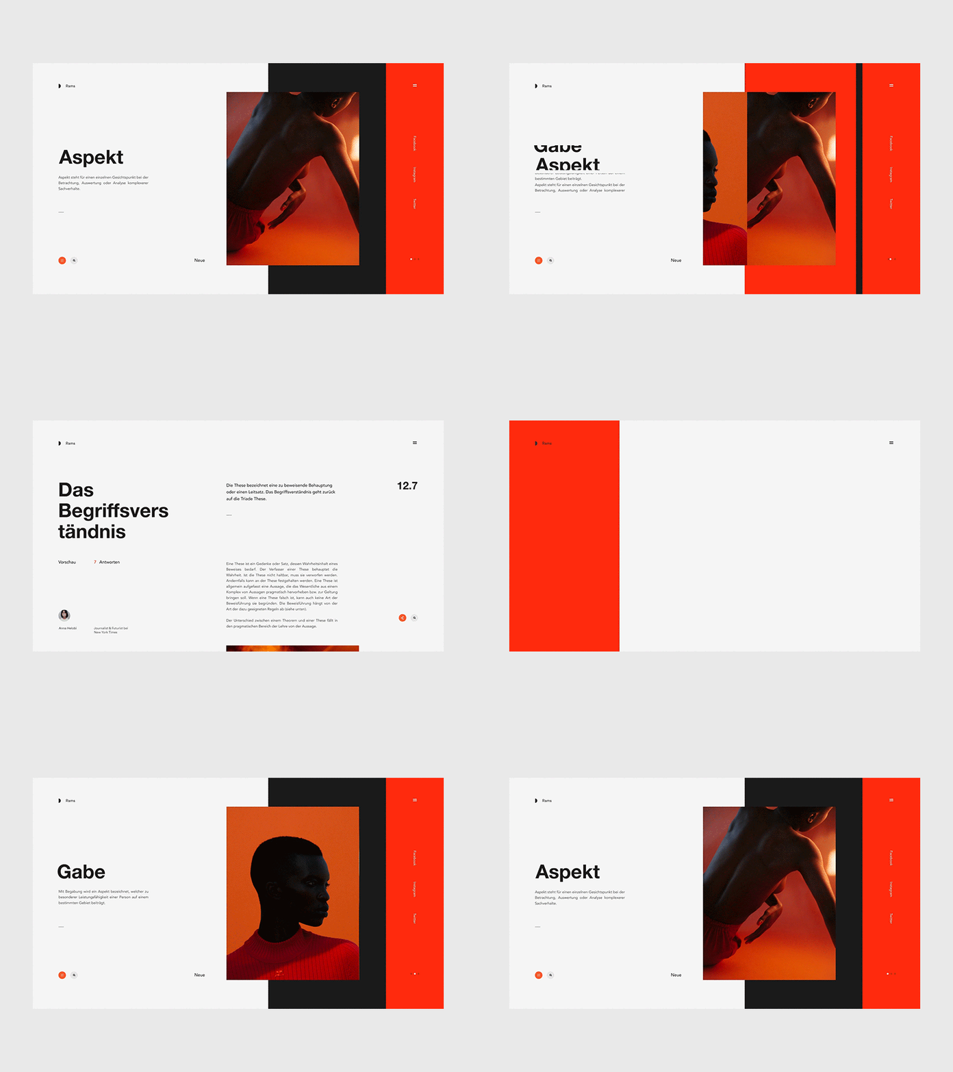
Sometimes we need to break something in order to appreciate it how good it was.
Or, sometimes not. The appeal of broken, asymmetric layouts is that it is distinct, experimental and non “cookie-cutter.” It’s an out-of-the-box way for smaller, up-and-coming brands to stand out.
It also forces the viewer to look at it differently, or spend more time trying to do so. It increases web engagement, let’s just put it that way.
need a web design quote ?
you may also like
proudly servicing
AUSTRALIA | BRAZIL | CANADA | FRANCE | GERMANY | ITALY | INDIA | JAPAN | MEXICO | NETHERLANDS | NORTH AFRICA | PORTUGAL | SPAIN | SOUTH EAST ASIA | SWEDEN | SWITZERLAND | TURKEY | UNITED KINGDOM | UNITED STATES
© 2026 BLACKSOC. ALL RIGHTS RESERVED.
