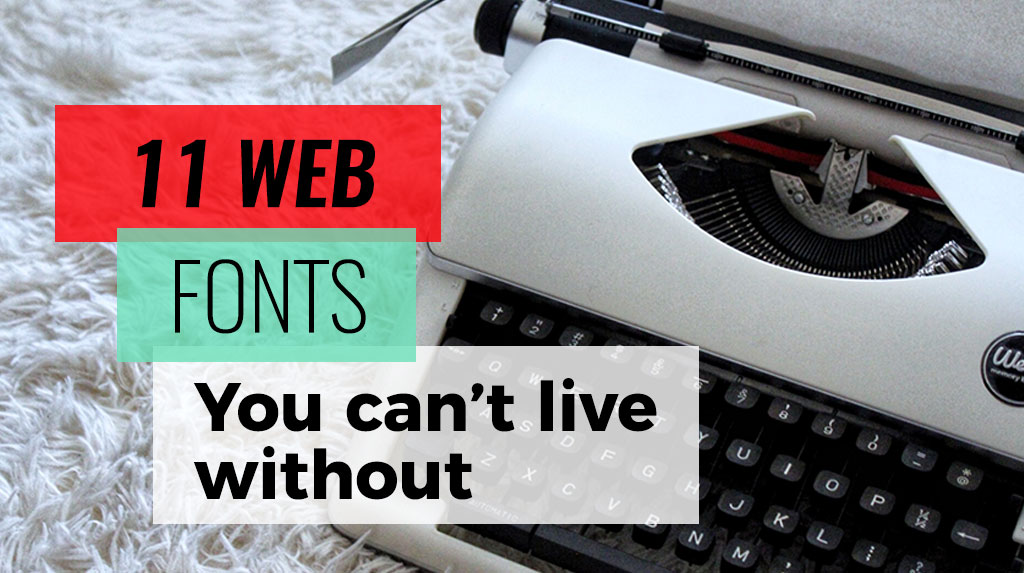
11 WordPress Fonts You Can’t Live Without
The Best WordPress Fonts and How To Use Them
There is no doubt about it: Words matter.
As important as the meaning of the word is its design.
Typography is an integral element of web design and its importance can not be overstated. Font choice will have a far-reaching impact on so many things including user experience, branding, readability, and mood.
We’ve put together the 11 Best WordPress Fonts.
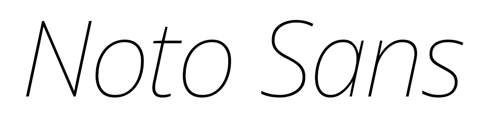


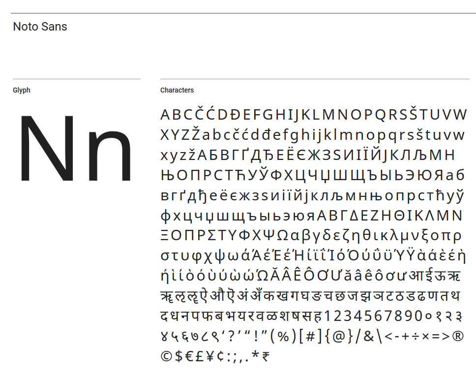
1. Noto Sans
Clean and simple, Noto Sans is currently in use in more than 3 million websites. Its popularity is due to the fact that it was conceived with the goal of eliminating “tofu” — those little boxes that appear when a certain character can not be converted whether it be into another language, platform or device.
Noto Sans is the best option for text on multi-lingual websites, and today it supports 30 different scripts and will cover all of Unicode in the future.
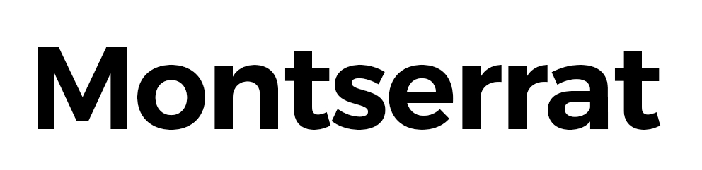
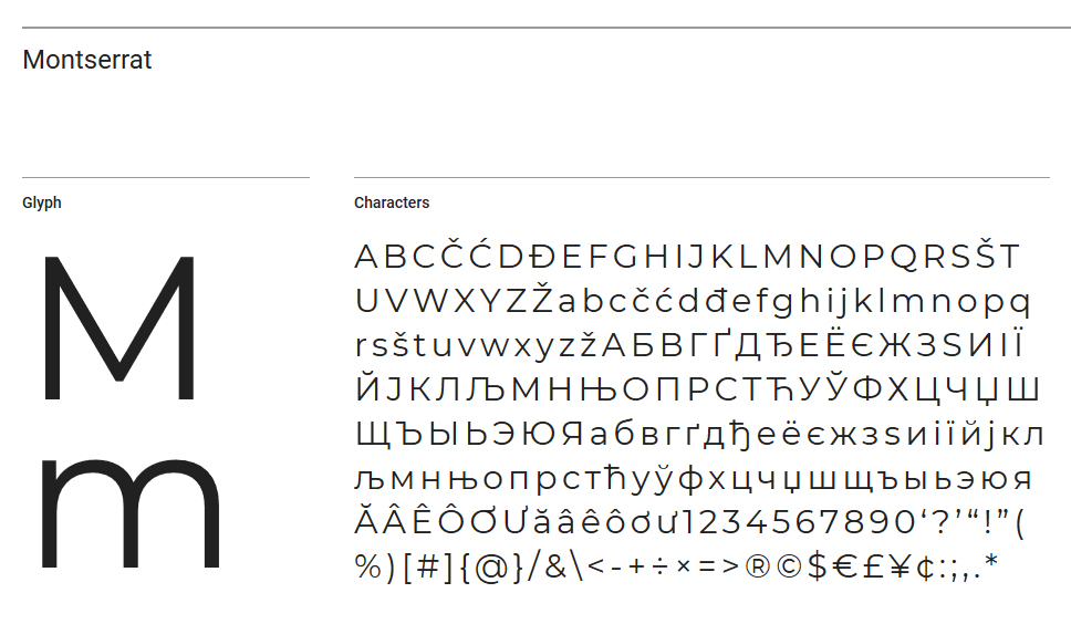
2. Montserrat
According to Google, the old posters and urban signs in the Montserrat neighborhood of Buenos Aires inspired type-set designer Julieta Ulanovsky to create this font and rescue the beauty of urban typography characteristic of the first half of the twentieth century.
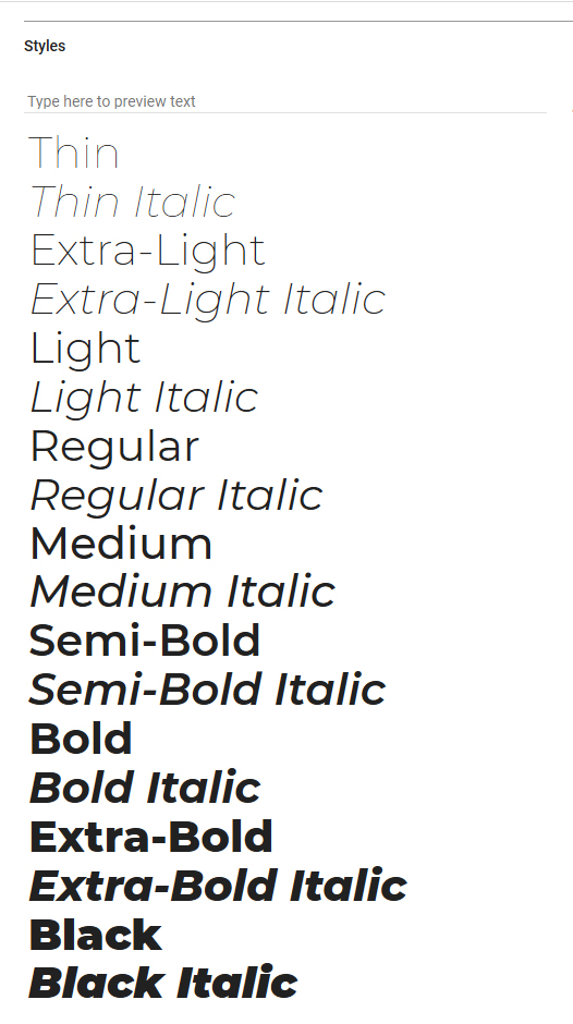
Currently in use in more than 5 Billion websites, this versatile font can communicate a variety of moods thanks to the 18 different fonts styles that it offers from Thin to Black Italic. However our favorite use of this font is in all CAPS because of how organized and clean it feels.
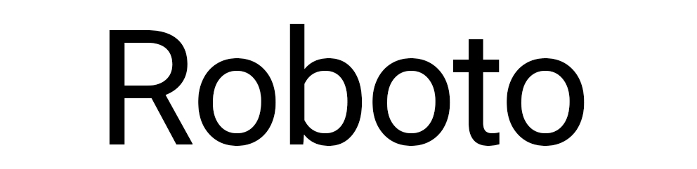
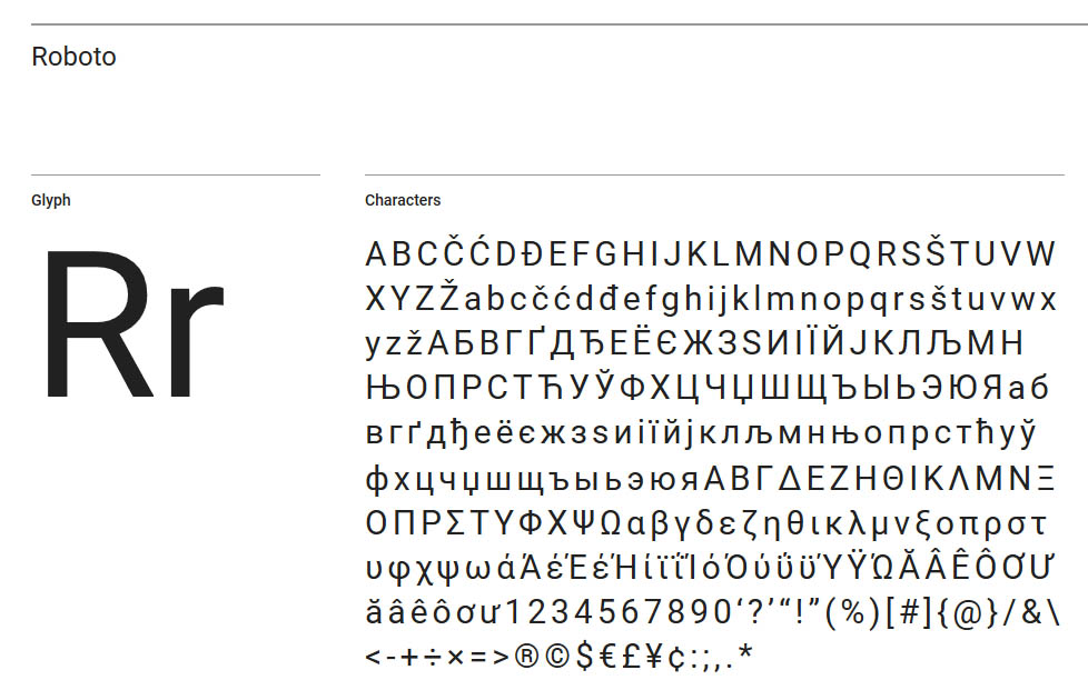
3. Roboto
Much like its name suggests, the Roboto font family is very modern and geometric. Yet while it does harken the “robot” age, there is a softness and friendliness about it thanks to its rounded edges.
A more condensed type face, it is one of the most readable fonts allowing letters to be settled into their natural width. This makes it extremely versatile for both headers and paragraph text. Available in more than 27 Million websites, we love this mainly for the more “serious” industries such as finance, law and health & wellness.
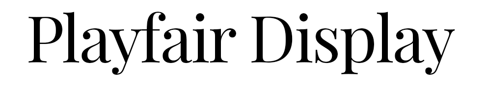
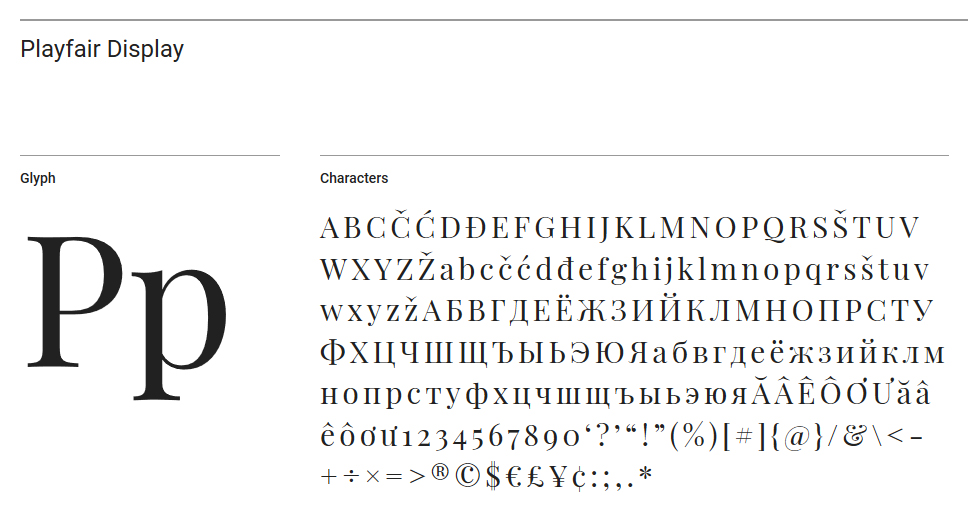
4. Playfair Display
Conceived by lead designer Claus Eggers Sørensen based in Amsterdam, Netherlands, Playfair Display was inspired by the Enlightenment era when quills were replaced by pointed steel pens.
Characterized by the contrast between thick strokes and delicate hairlines, the font family converys and a kind of detached hand written penmanship that is prefect font to convey elegance, legacy, and establishment.
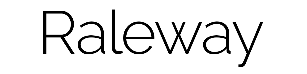
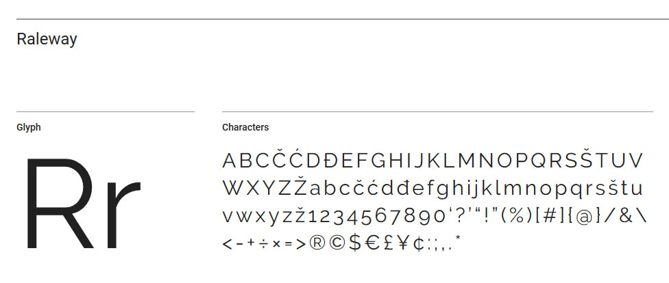
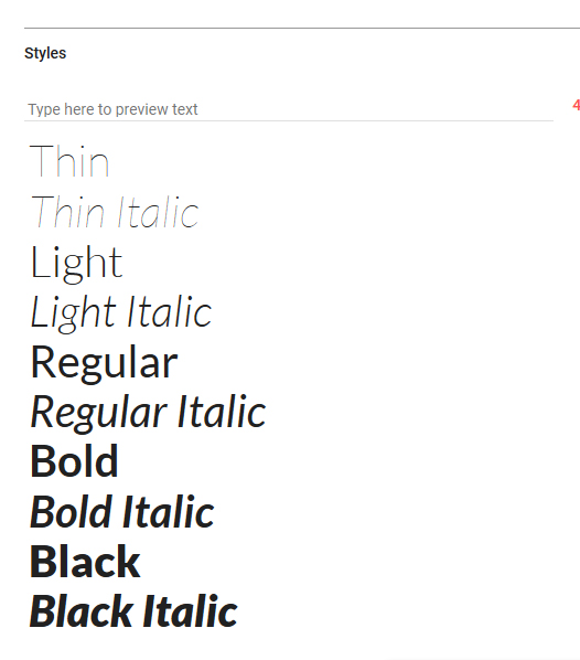
5. Raleway
Back in the day (we’re talking like 4-5 years ago), Raleway was one of the few alternatives offered outside of the usual consortium of Arial – Open Sans – Verdana et. al. available on most WordPress themes. As such it quickly grew in popularity, offering a slightly more whimsical option to the usual “Word” press fonts that we had seen time and time again.
After its expansion into 18 font styles in 2012, the font has exploded and is now being used in more than 6 Million websites. Aside from being appropriate for both headers and body text, it is distinguished by its numerals which bobble above and below the meridian line.
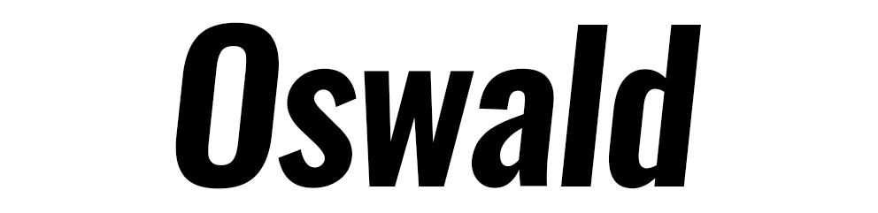
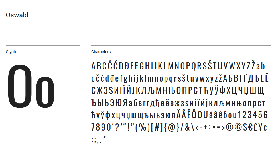
6. Oswald
Oswald is a modern reworked version of the “Alternative Gothic” sans serif style of type faces. Created by Vernon Adams, currently based in California, it was recently updated by Kalapi Gajjar and Alexei Vanyashin in 2016 to support languages that use the Cyrillic script.
Since then, the font has exploded and has become a fresh, new approach to sans serif fonts thanks to its compact, vertical nature and rounded, bold form.
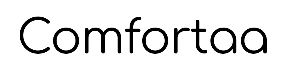
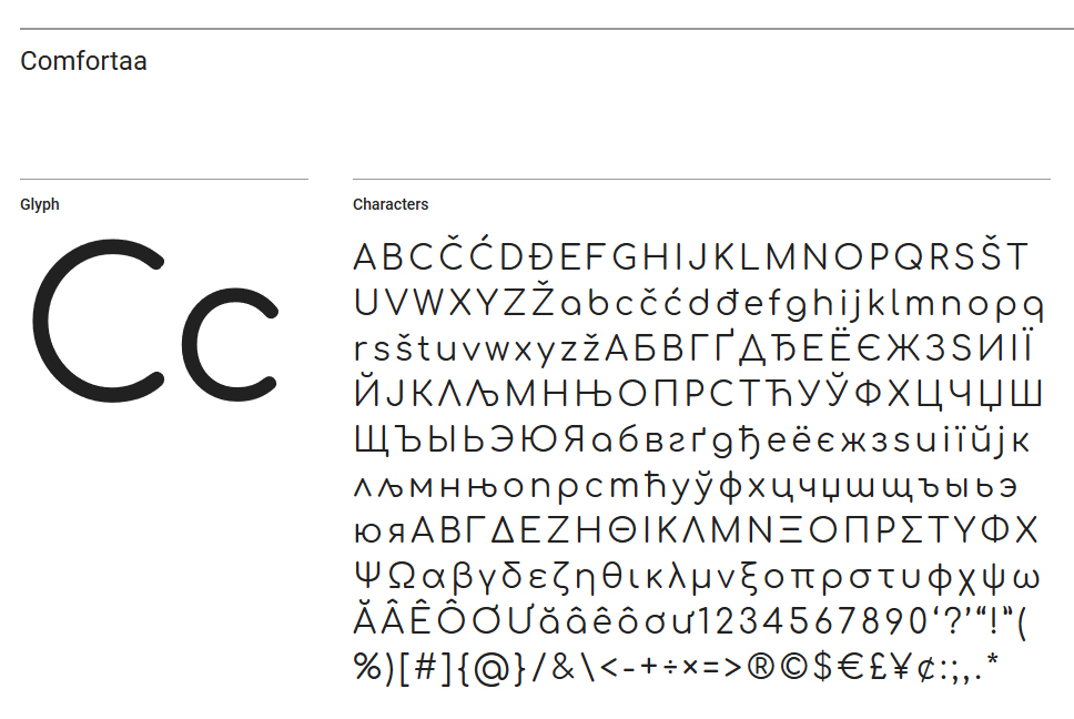
7. Comfortaa
The two main design principles of Comfortaa are its geometry and roundedness. Created by Johan Aakerlund, it is intended to be used in large sizes and formats.
What we love most is the completely symmetric O and C, as well as its stylish use of Cryllic fonts and coverage of European languages.
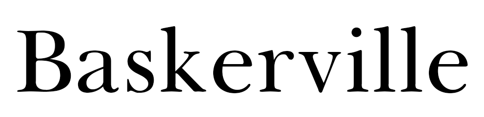
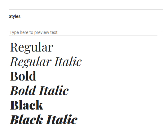
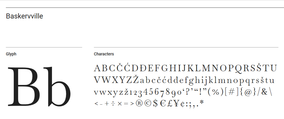
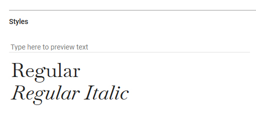
8. Baskerville
Designed in the 1750’s by John Baskerville in Birminghamd, England, the Baskerville font is a serif known for its contrast between thin lashes and thick strokes, with an axis that is more vertical than horizontal.
According to Wikipedia, Baskerville’s typefaces were proprietary to him and then later sold to a French publisher after his death. As such, many different type face designs influenced by him were made by British punchcutters over the decades. Today, several versions of the font are available online and all reflect the original spirit of friendly serif type-setting.
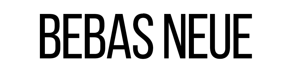
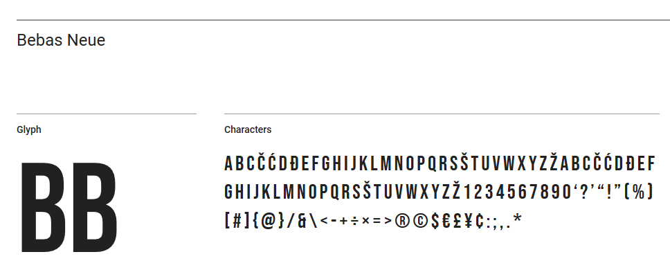
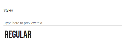
9. Bebas Neue
Designed by Ryoichi Tsunekawa, Bebas Neue has exploded recently mainly in applications for packaging, headlines and logos.
Limited to a fully upper-case font, its vertical compact nature easily lends itself to social media graphic which are limited in digital real estate, but who want to make a maximal impact.
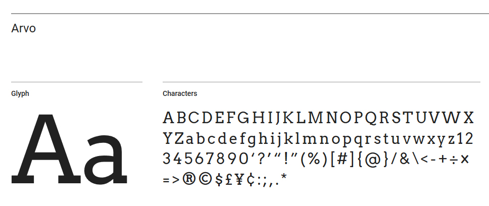
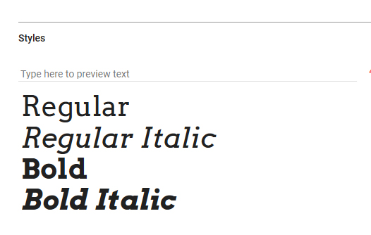
10. Arvo
A geometric slab-serif typeface family suited for screen and print designed by Anton Koovit. Althought “Arvo” is a typically Estonian name, in Finnish it means “number, value, worth.”
Therefore with a nod to computer programming, Arvo is a modern yet friendly instance of a serif font that translates seamlessly from web to print and to everything in between.
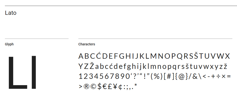
11. Lato
In 2007, Łukasz Dziedzic from Warsaw created a three-style Latin and Cyrillic corporate family for empik, one of Poland’s largest retail networks. In 2010, he started the Lato project, to develop a high-quality open-source font family.
“Lato” means “Summer” in Polish and has been somewhat a project of “rebirth.” Originally, the family was conceived for a large corporate client and who in the end decided to go in different stylistic direction, thankfully allowed the designer to make it become available for a public release.
need some font advice?
you may also like


proudly servicing
AUSTRALIA | BRAZIL | CANADA | FRANCE | GERMANY | ITALY | INDIA | JAPAN | MEXICO | NETHERLANDS | NORTH AFRICA | PORTUGAL | SPAIN | SOUTH EAST ASIA | SWEDEN | SWITZERLAND | TURKEY | UNITED KINGDOM | UNITED STATES
© 2026 BLACKSOC. ALL RIGHTS RESERVED.