Embrace these latest trends to ace your app’s UI and UX
The newest generation of app designers are faced with new opportunities and challenges every day. The biggest battle is keeping users engaged and returning to your app, with 90% of users not returning to the app after 30 days. It is an uphill battle for app designers to re-engage and re-entertain users to sustain meaningful traffic to their application. We’re here to help you hone in on the most important trends and how they could propel your brand or business.
What is UX? UX refers to user experience, how they use and interact with the app. Why is UX important? The key to maintaining user engagement is developing an app with excellent UX, as 88% of online consumers are much less likely to never return to a site after a bad experience. The answer to this is being aware and ready to act when new app design trends arise.
What is UI? UI refers to the user interface, the design of the app encompassing all visual elements of the app including color palettes, font pairings, images and much more. Why is UI important? Quality UI ultimately improves user experience with faster loading times and enhanced app navigation throughout. An exciting and intuitive user interface helps gain credibility, as reportedly 75% of people judge a website’s credibility entirely on aesthetics. Undoubtedly UX and UI design go hand in hand in creating and maintaining a functional, interactive, and ultimately successful application. The easiest way to summarize the difference is:
UI is the saddle, the stirrups, and the reins. UX is the feeling you get from being able to ride the horse.
Stay ahead of the curve with the following UX trends in app design:
1. Easy Onboarding
2. Navigation
3. Minimize Input & Commitment from User
4. (Micro-) Interactive
5. Credibility
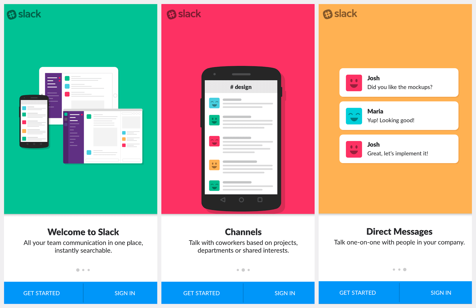
1. Easy Onboarding: Inspire the First Action
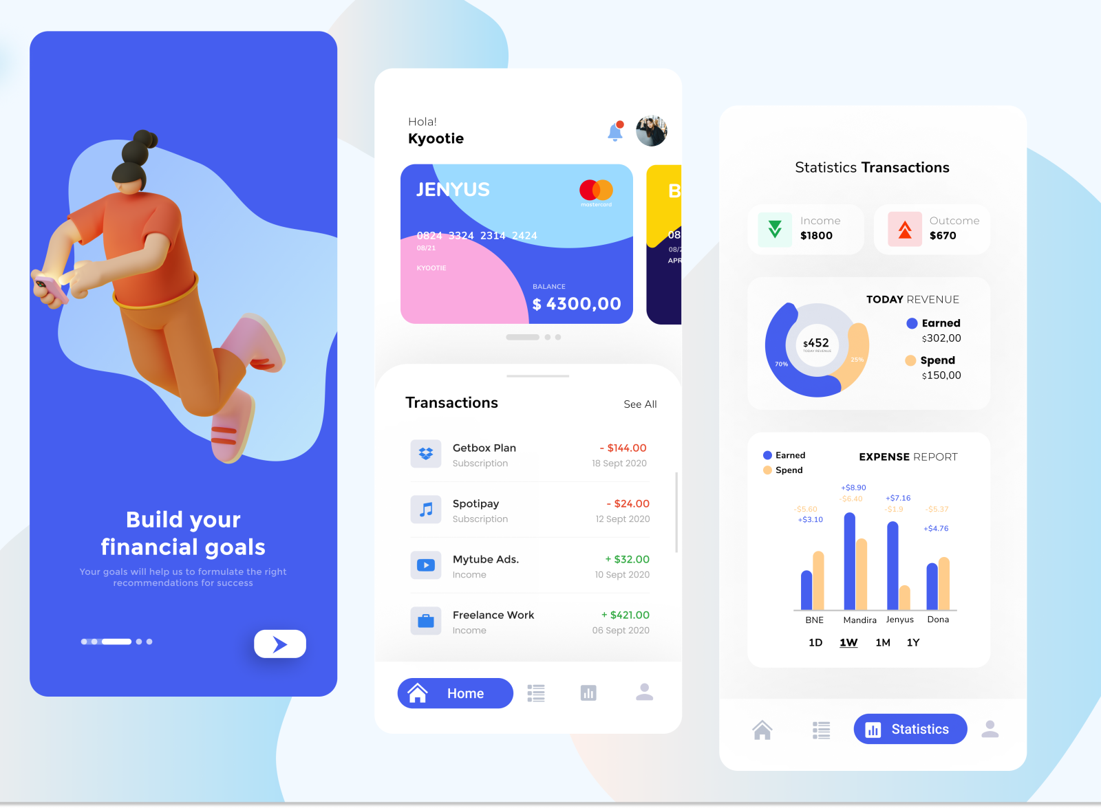
User onboarding is a designed series of interactions and instructions that help the user ease into the product experience. This typically occurs when a user first opens a new app, it is a series of screens with short, friendly phrases explaining what the app is about. An app with a good user onboarding process can increase user engagement by 4x. To do this following these three principles; being benefit focused, persona-based and making first success easily achievable.
- Benefit focused: explain the most important benefits to the user, how is your app different to the others?
- Persona-based: speak directly to your target user
- Making first success easily achievable: a user that achieves first success is more likely to stay
It also produces a calming effect, allowing the viewer to easily digest the information on the screen right in front of them. The urge to scroll down becomes less so, and the idea of time suddenly feels like it might be on your side.
from Serra Alban
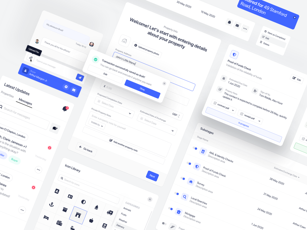
2. Navigation: Keep the clicks to a minimum
Whether the long debated “3-click rule” is true or false, the main goal remains to keep click-to-a-page or screen at a minimum. But how do you implement this?
- When a click leads to a new page, it needs to load fast. 5 fast clicks are preferable over 3 long ones
- Clear and easily understood menu words– avoid vague or ambiguous words in menus and buttons
- Simple is the way forward- overly complicated hierarchies and multilevel menus promote confusion among users
Consider checking out Google’s Core Web Vitals report for unified guidance on delivering accessible navigation.
from Mertcan Esmergül
3. Minimize Input & Commitment from the User
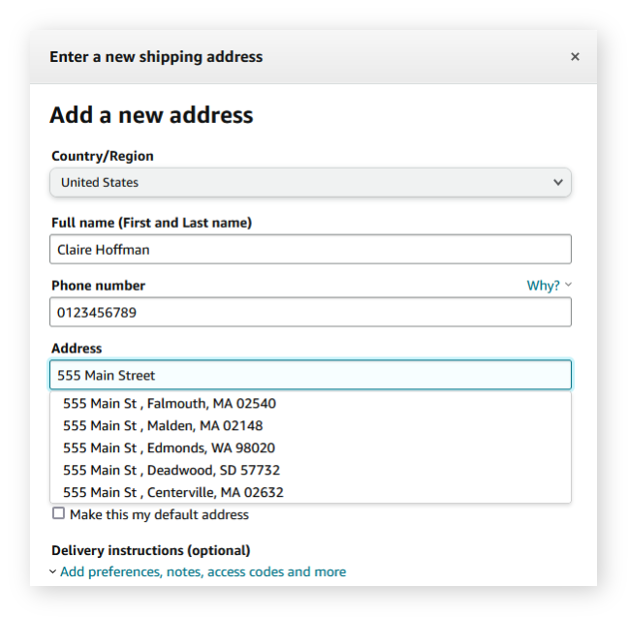
Allow users to explore your app without completing time consuming onboarding forms. Instead offer things like location tracking and inputs. This offers users an effortless experience, by getting them to where they want to go whilst reducing typing. Form pre-fill features:
- Reduce abandonment rates by eliminating the tedious form-filling process- with 76.9% of shoppers having previously abandoned checkout due to lengthy forms
- Increase data accuracy, security, and validation by leveraging phones and phone numbers
- Provide confidence to merchants if the address is verified by the local post office
Amazon
4. Minimal Studio Photography
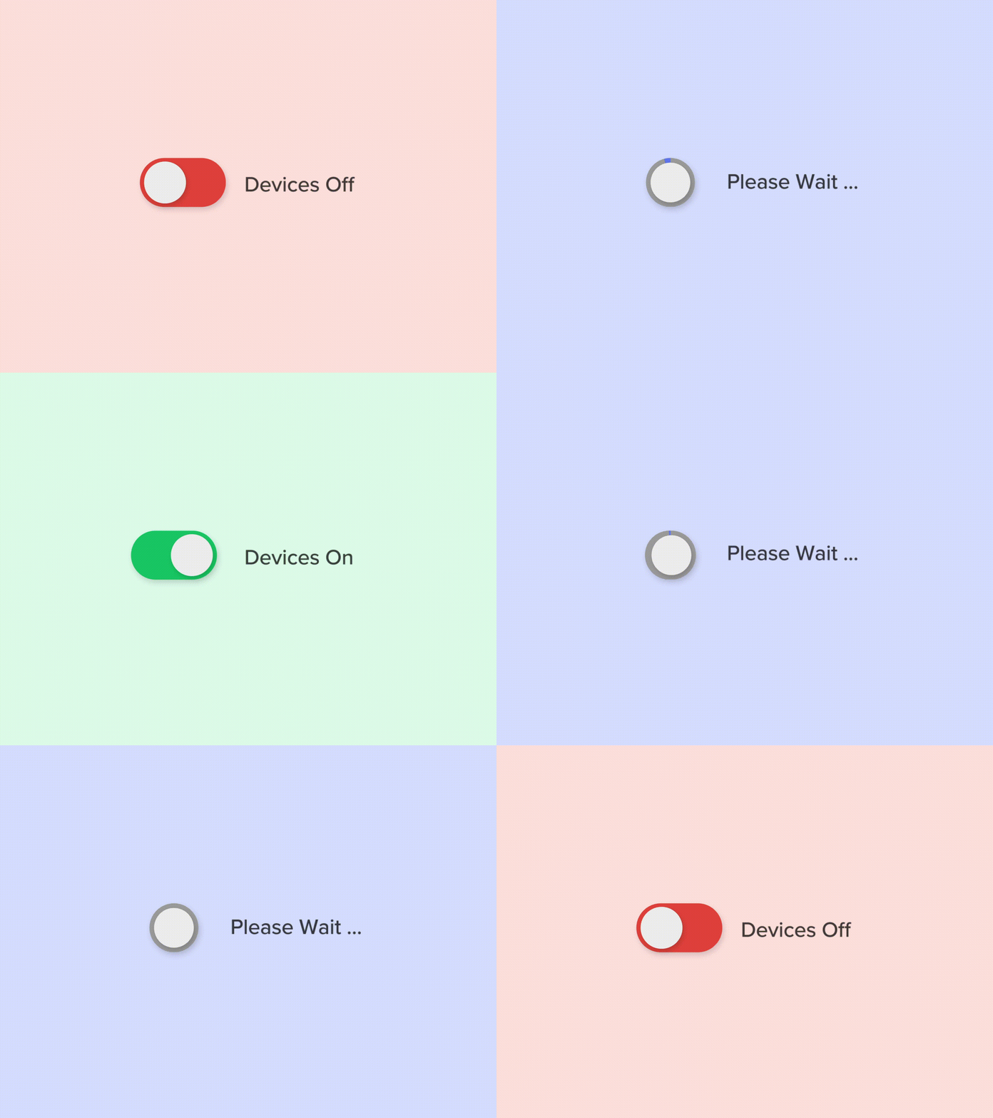
Make it fun. Micro interactions are functional animations at the point when the user and the interface interact. These are the small visual elements that have a large impact on UX, playing into user engagement and retention. Examples include allowing for single-instance interactions, changing user settings, and helping prevent mistakes. Always ask yourself:
- What is the trigger?
- What happens when the trigger is actioned?
- What is the user feedback?
But always keep it simple.
from Mauricio Bucardo
5. Credibility
Deliver on your promise. Then stop. Credibility relates to a user’s ability to trust in your product. You need to convince them to install the app and give them reasons to return. If your app distracts them with confusing features, they will lose faith in your app. App ratings and reviews directly impact on your app’s credibility as 50% of mobile users saying they wouldn’t consider an app with a 3-star rating. In-app ads are the biggest deterrent causing many problems including poor quality (as they are vendor-generated ads) and flawed designs making it difficult to close. Avoid notification bombardment, pushy push notifications and frequently requesting ratings.

from Usability Geek
You can have the best financial tech on the market and the best marketing team on earth to promote it. But if people don’t like using your product, it will fail.
5 UI trends you need to know about:
1. Gradients
2. Hi-Contrast Color Pops
3. Minimalist Design
4. Maximal Fonts
5. Neomorphism
1. Gradients
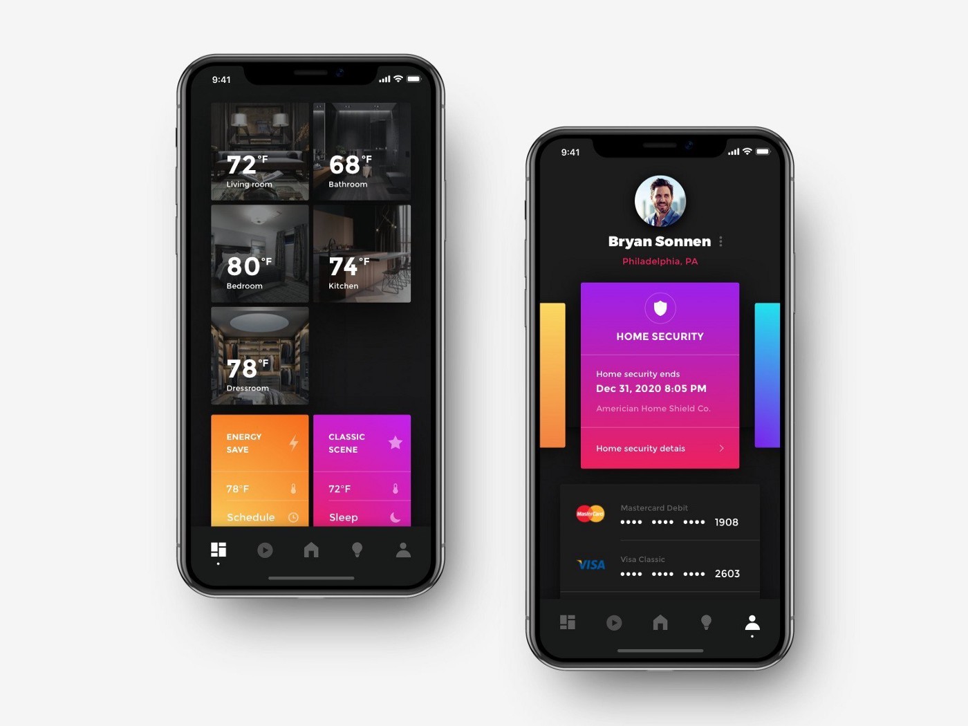
Gradients are a gradual blending from one color to another. This design trend has been gaining momentum in recent years, today UI gradients have an airy, light feeling most commonly being served as backgrounds providing interface depth and dimension. The combination of vibrant colors ensures they stand out and helps to elevate your UI design. Most common gradients you’re exposed to are probably Facebook Messenger and Instagram app icons.
by Shakuro
2. High-Contrast Color Pops
Bold and youthful color combinations, with neon flashy palettes have been on the UI design scene for a few years but they show no signs of going away. Bold colors pair together producing eye-catching effects. The most used colors are bright pinks, greens, royal blues, and reds, providing a stunning contrast to a simplistic white background. This results in an exciting yet minimal feel.
by Afrills
3. Minimalist Design
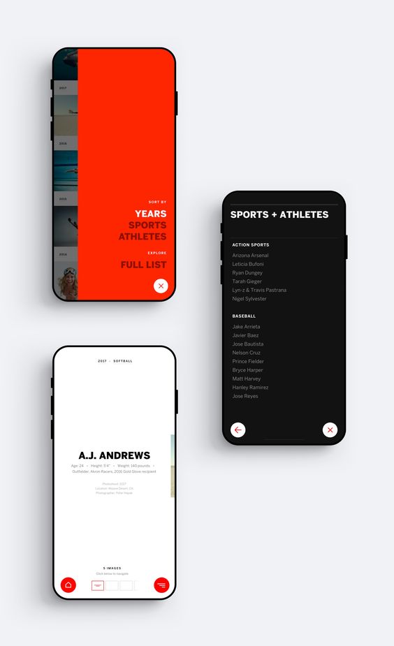
Minimal UX designs and clean interfaces have been popular in recent years. Minimalism is all about emphasizing the app’s content and leaving the design as a quiet supporting force. Minimalist designs provide a clear focal point on each screen whilst reducing eye fatigue and battery consumption. Keep it simple. Apps need to be streamlined, simplified and uncomplex. Minimalism, the main principle of which is “Less is more.” Minimalism focuses on “The More of Less”—as stated in the title of the American author Joshua Becker’s book—which means to declutter visual spaces, to give more attention to what matters most.
by Kasper Laiggaard Studio
4. Maximal Fonts
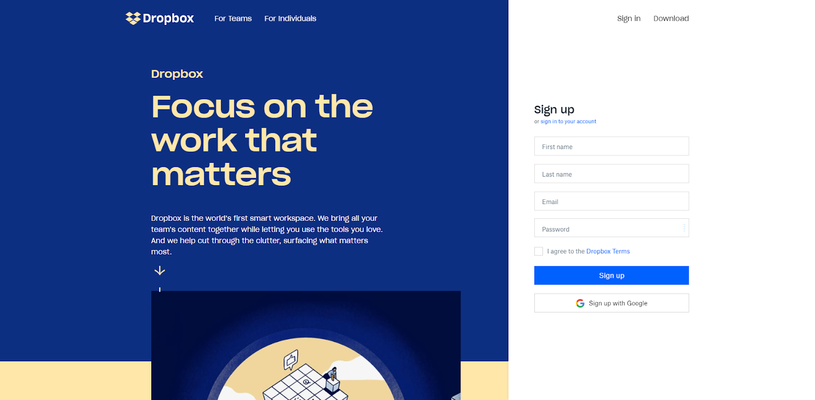
As mentioned above, the key to successful UI design is knowing when and where to direct the user’s attention such as to salient messages or CTAs. Be bold. Bold typography is becoming increasingly adopted in app designs, offering a counterpart to minimalism, and helping you stand out in a crowded digital marketplace.
by Dropbox Homepage
5. Neomorphism
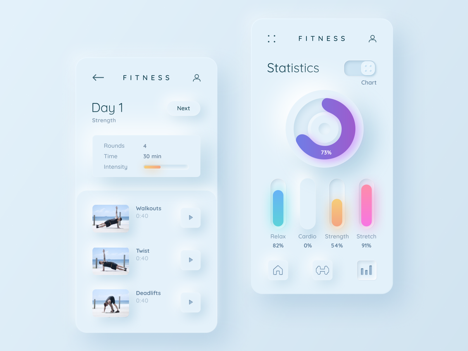
This trend otherwise known as ‘soft design’ mimics real life objects by combining background colors, shapes, gradients, highlights, and shadows. It originates from the expression “New Skeuomorphism” and the term was coined by Michal Malewicz in 2019. This achieves a soft, extruded plastic look, with 3D styling. This brings clean interfaces to life by adding a physical element to the flat UI paradigm. It is important to note this trend comes with its potential accessibility issues in terms of visibility. The main problem is the lack of figure to background contrast ratio, making it hard to distinguish visual elements. Implementing neomorphism into your design you need to strike the right balance between attractive interfaces and usable interfaces.
by Mariia Tokar
In summary… The creation of accessible, enjoyable, and alluring UX and UI should be a top priority in the coming years. Staying alert and informed of these top ten trends and new up and coming trends is a great foundation for app and ultimately business success. Whether you need to kick start your app designing process or fine tune your existing app at Blacksoc we can help. We offer services such as responsive design and development and custom software design.
need an app design quote ?
you may also like
proudly servicing
AUSTRALIA | BRAZIL | CANADA | FRANCE | GERMANY | ITALY | INDIA | JAPAN | MEXICO | NETHERLANDS | NORTH AFRICA | PORTUGAL | SPAIN | SOUTH EAST ASIA | SWEDEN | SWITZERLAND | TURKEY | UNITED KINGDOM | UNITED STATES
© 2026 BLACKSOC. ALL RIGHTS RESERVED.
