Embrace these latest trends to ace your colour prowess
Research shows that website visitors form opinions within seconds, and color plays a key role in shaping those impressions. The right color palette can evoke emotions, guide user behavior, and increase conversions.
By understanding color psychology and applying color theory — a concept that explains how colors interact with each other and how they can be combined to create certain feelings, moods, and reactions — you can create a website that resonates with your audience and supports your goals.
Stay ahead of the curve with these 7 colour design trends:
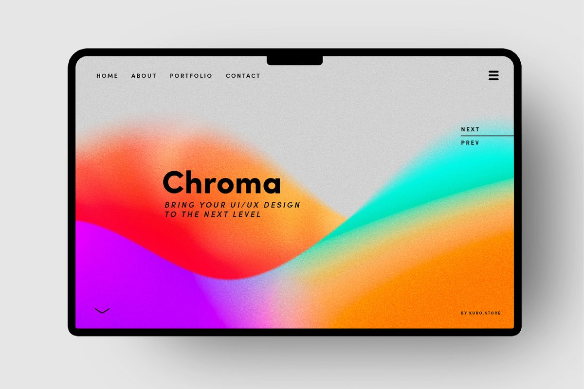
1. Vibrant gradients
Gradient backgrounds have come back with a fresh twist. No longer just a subtle blend of colors, modern gradients are bold, vibrant, and dynamic. Designers are mixing unexpected color combinations, such as coral and teal or deep purple with neon pink, creating visual depth and movement. These bold gradients help highlight key areas of a webpage, provide texture without overwhelming the content, and evoke a futuristic vibe.
Why It Works:
Vibrant gradients can evoke emotions and draw attention, creating a sense of energy and modernity. They’re especially effective for startups or tech companies that want to communicate innovation and creativity.
designed by Kuro
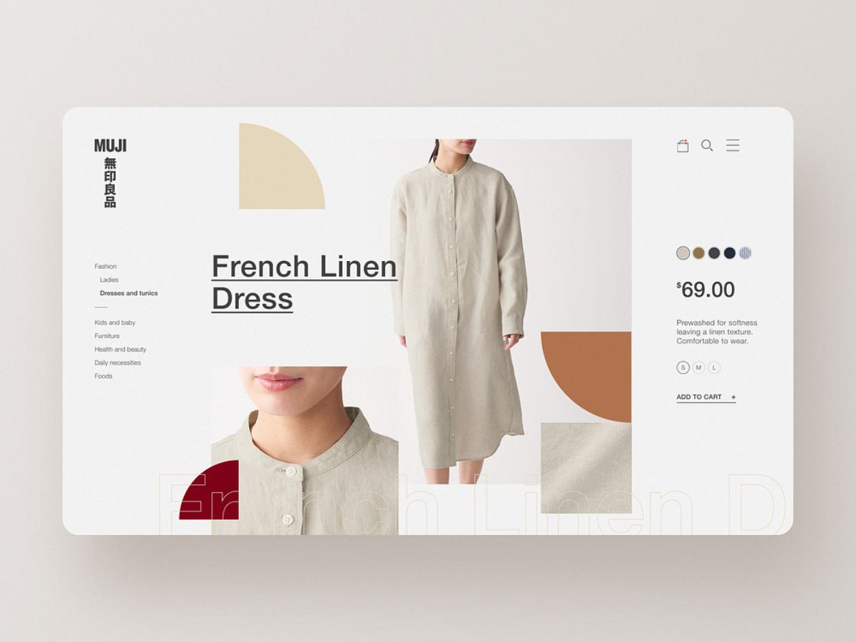
2. Earthy tones
As sustainability becomes an important theme in both product development and lifestyle, web design is reflecting this trend with earthy and organic color palettes. Think warm browns, muted greens, terracotta, and soft beige. These natural hues give websites a grounded and calming effect, appealing to brands focused on wellness, environmental consciousness, and minimalism.
Why It Works:
Natural tones create a soothing and approachable aesthetic. They work well for brands wanting to build trust and communicate a connection to nature or sustainability.
designed by Neil Hamilton-Ritchie
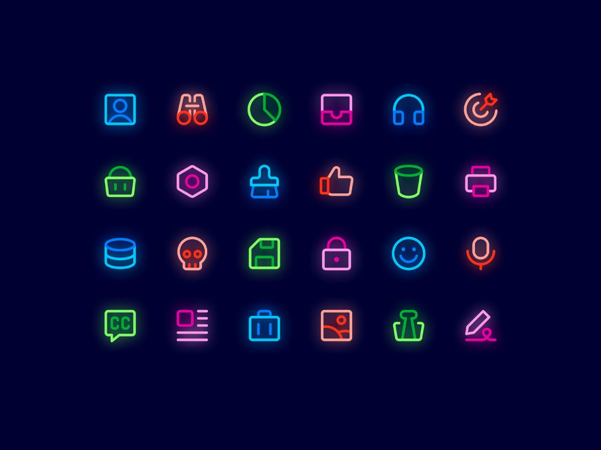
3. Neon accents
While the primary color palette may stay neutral or muted, the use of neon accents is on the rise, adding a pop of excitement to otherwise minimalistic designs. Designers are incorporating electric yellows, neon blues, and hot pinks in buttons, text highlights, or borders. These bright neon touches can create an element of surprise and elevate a clean design with a touch of playfulness.
Why It Works:
Neon accents are eye-catching and can direct attention to specific areas of a site. They bring a high-contrast, energetic feel to an otherwise subtle design, making them ideal for entertainment or creative industries.
designed by Streamline HQ
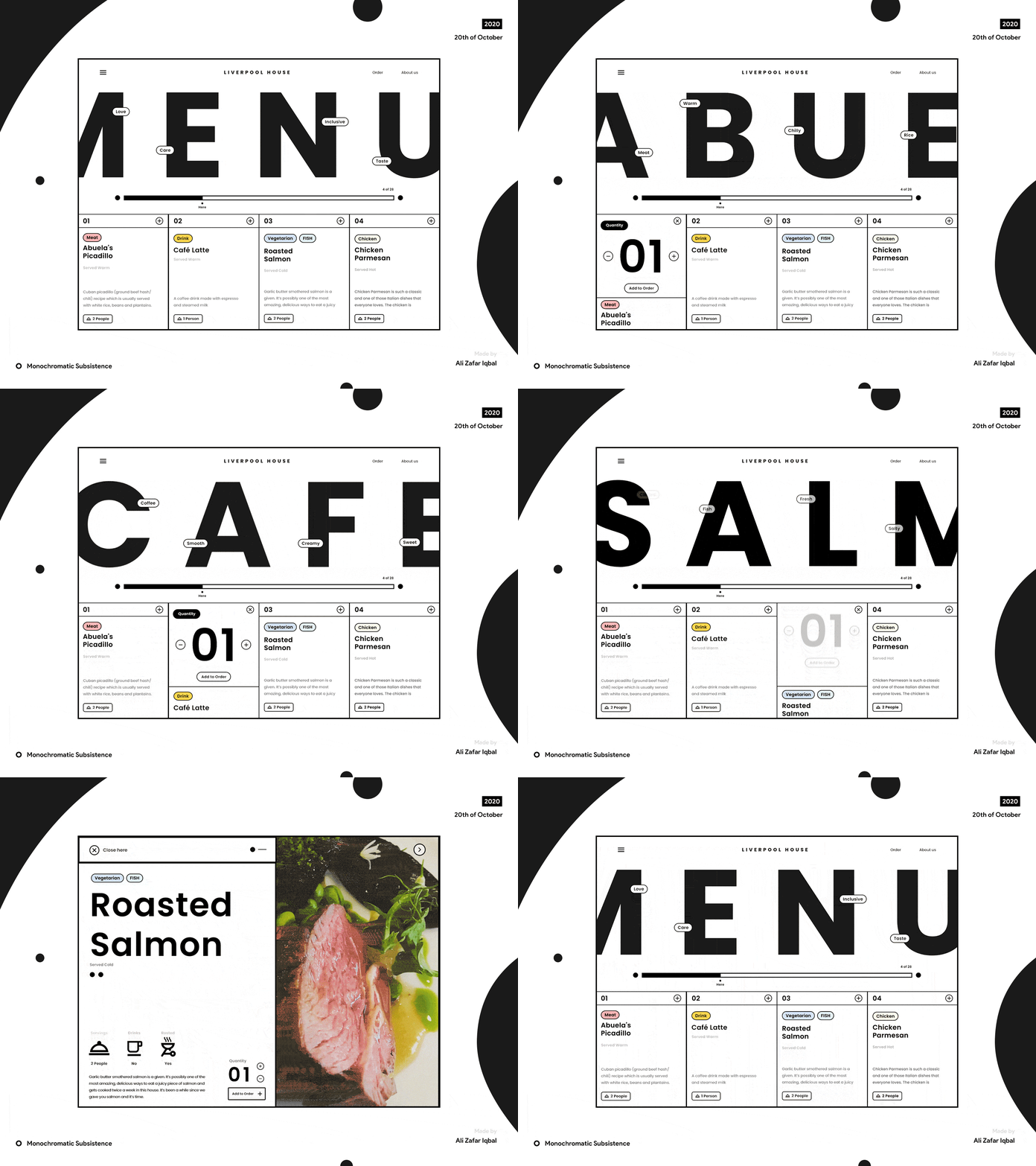
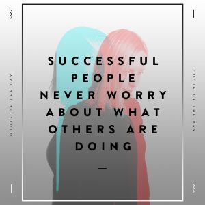
4. Black + White
Black and white web design is, at its core, a minimalist approach that emphasizes simplicity, elegance, and contrast. By removing the distraction of color, this design style highlights key elements like typography, layout, and imagery. It allows users to focus more on content and functionality, creating a clean and timeless aesthetic. The stark contrast between black and white also enhances readability and visual clarity, making it a popular choice for modern, sophisticated websites.
Why It Works:
Black and white schemes are timeless and versatile. They create a unified look that feels modern and clean, helping users focus on content without being distracted by too many visual elements.
designed by Ali Zafar Iqbal
5. Retro
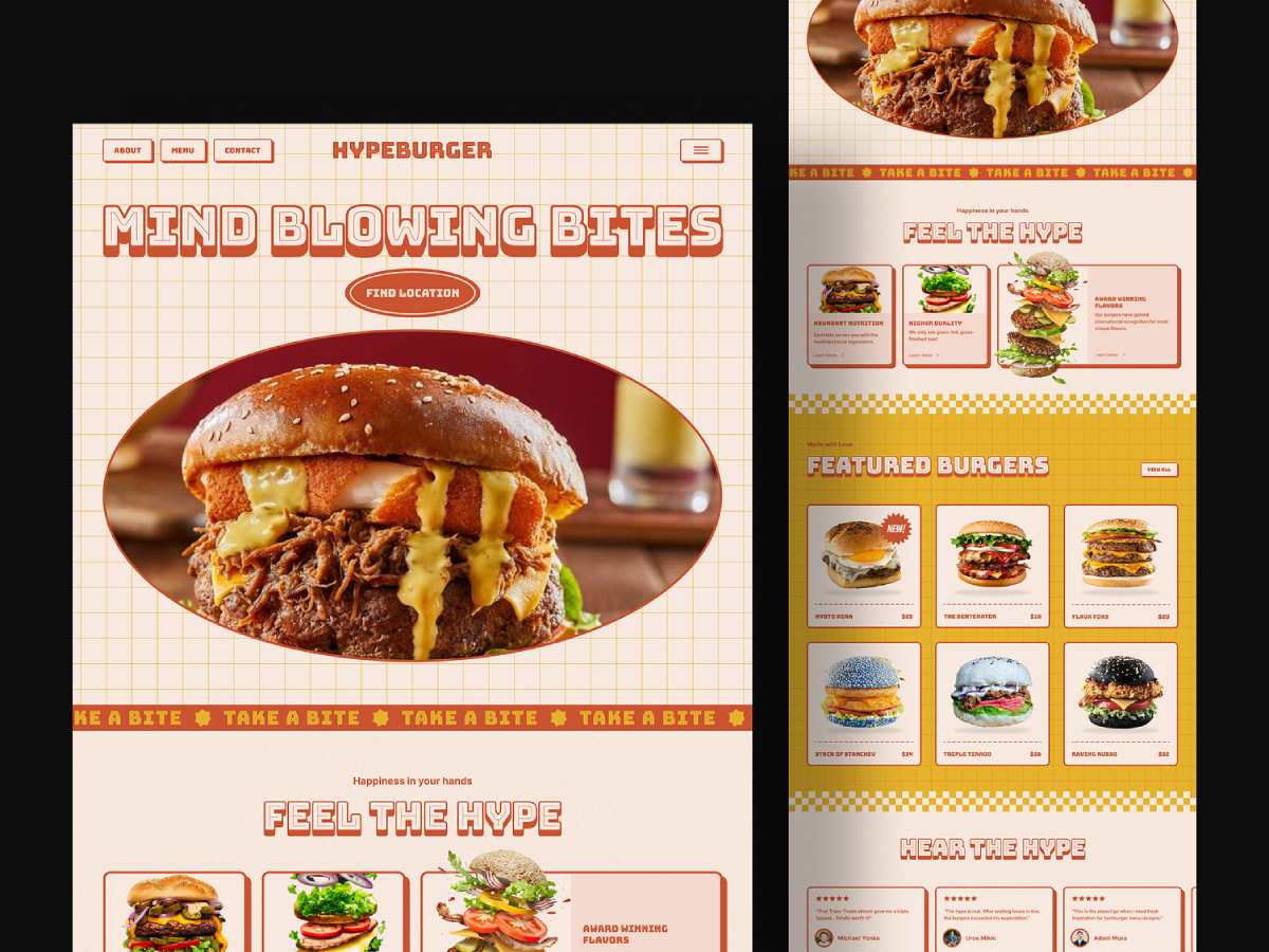
Retro colors have made a resurgence, with designers drawing inspiration from the ’70s, ’80s, and ’90s. Palettes rich in mustard yellows, muted oranges, faded blues, and warm browns evoke nostalgia and bring a unique character to modern websites. This trend is particularly popular for brands that want to evoke a sense of history, authenticity, or playfulness.
Why It Works:
Vintage colors can create a sense of familiarity and warmth. They stand out because they break away from the ultra-modern, sterile designs that are common in tech, making them perfect for brands that want to tell a story or build a strong, memorable identity.
designed by Alway Rallos
6. Dark mode
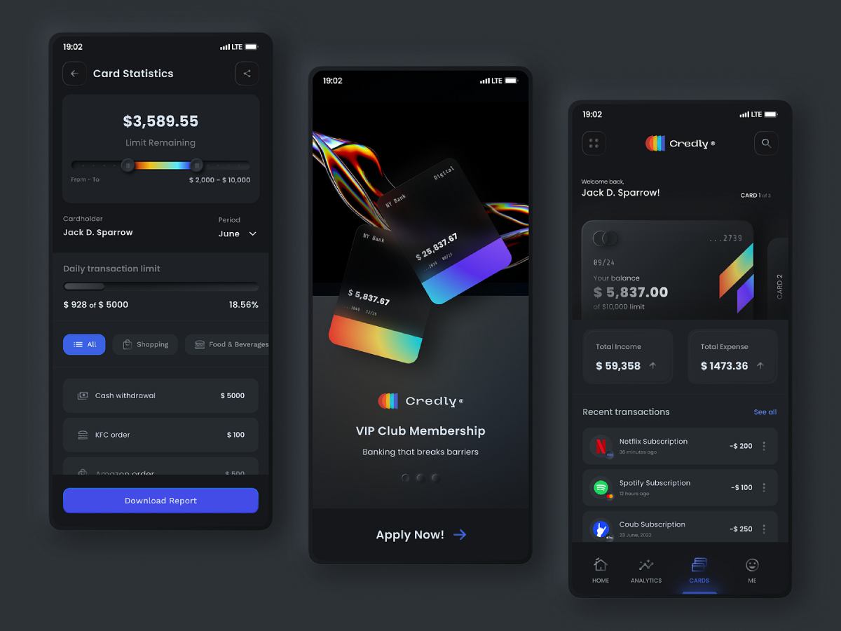
Dark mode continues to be popular, but designers in 2024 are pushing the envelope with rich, deep hues. Colors like navy blue, forest green, and charcoal black are being used for more than just aesthetic purposes — they enhance the readability of light-colored text and reduce eye strain. The dark mode trend also pairs well with sleek, professional, or luxury-focused websites.
Why It Works:
Dark mode isn’t just a design trend, it’s a practical feature that improves the user experience. Deep, rich colors create a sense of elegance and are often associated with premium or high-end brands.
designed by Akshay Hooda
7. Soft pastels
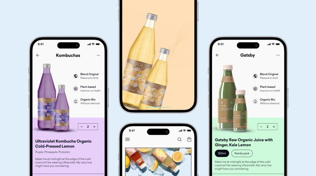
Pastels aren’t just for spring — they’ve become a web design staple for 2024. Soft lavender, baby blue, mint green, and blush pink are used to create a gentle, welcoming aesthetic. These soothing colors evoke a sense of calm and are popular among wellness, fashion, and beauty brands that want to exude a serene or approachable image.
Why It Works:
Pastels create a light, airy feel that resonates with users who prefer a more calming visual experience. They are often associated with warmth and friendliness, making them ideal for brands looking to create a peaceful and positive connection with their audience.
designed by Musemind Mobile
Summary
It’s all about balance. Whether you’re experimenting with vibrant gradients or opting for more grounded, earthy tones, it’s important to ensure that your color choices enhance the user experience and reflect your brand’s identity. Choosing the right colour palette will not only make that connection stronger with your customer, it will guide users and boost conversions on your website and social media.
need some colour design help ?
proudly servicing
AUSTRALIA | BRAZIL | CANADA | FRANCE | GERMANY | ITALY | INDIA | JAPAN | MEXICO | NETHERLANDS | NORTH AFRICA | PORTUGAL | SPAIN | SOUTH EAST ASIA | SWEDEN | SWITZERLAND | TURKEY | UNITED KINGDOM | UNITED STATES
© 2026 BLACKSOC. ALL RIGHTS RESERVED.
